

What does it really take to supercharge your data skills with AI tools?
A quick recap of Supercharge v. Sabotage and a reminder to register for Chart Chat 72

On last month’s episode of Chart Chat, we dug into the ways AI tools could supercharge or sabotage an analyst.
If you missed the episode, you can catch the replay over on YouTube. You’ll get our musings and practical tips to help you do more supercharging than sabotaging if you’re bringing AI tools into your workflow.
In this newsletter are:
Register for Chart Chat 72: Show and Tell
Reflections on the discussion around AI tools in data analysis
How might we consider the potential risk of harm in our work (particularly when using AI tools.
Chart Chat 72: Show and Tell
Join us on Thursday, July 23 at 11AM EDT for Chart Chat 72. We’re holding a summertime show and tell, where we each bring an example of a project and share some of the learning from along the design journey.
Register so you get the calendar invite and reminders about where to hop on for the live stream over on YouTube or LinkedIn live.
After our July episode, we’ll be on summer holiday for August and plan to return with a new episode in September. In the meantime, you can always get your Chart Chat fix watching previous episodes over on YouTube.
Supercharge v. Sabotage
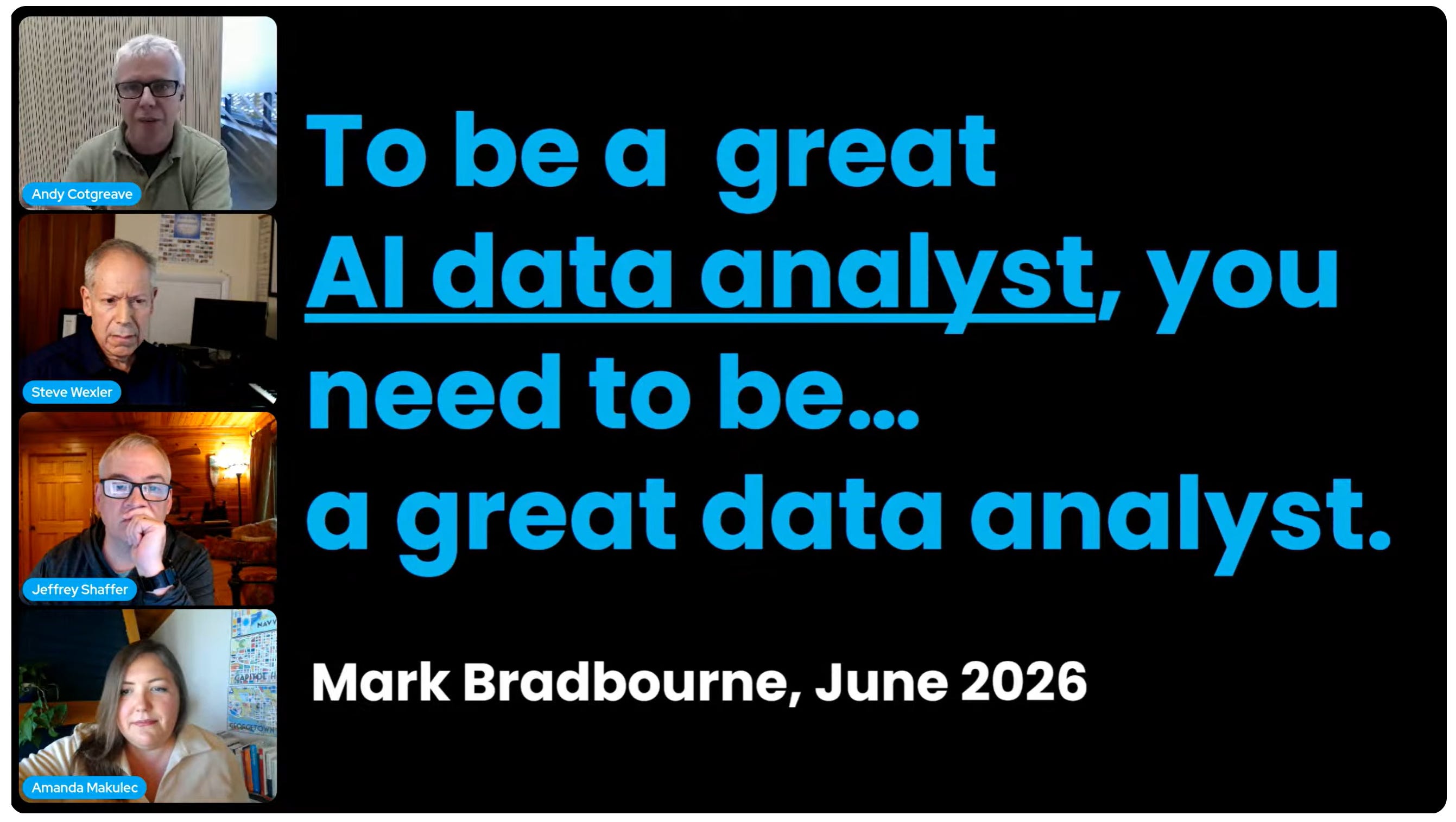
Looking back to last month’s episode, one central theme cut across the examples from all four of our segments, captured in a quote Andy shared:
“To be a great AI data analyst, you need to be…a great data analyst.”
Mark Bradbourne
AI tools are powerful new tools. If you use them to extend how you apply your knowledge, that can supercharge your capabilities. In data visualization, that could look like rapid prototyping dashboard concepts, data scraping, or even vibe coding whole applications (as a start).
But no matter where we bring these new tools into our work, it’s our responsibility to do data quality checks, bring the added context a model won’t have, and sign off on the final product when we publish.
How might we think more deeply about the risk of doing harm?
Beyond the usual checks for accuracy in the data representations, I’d suggest analysts take more time to consider the risk of doing harm with our work including:
Who is our audience —> to think more deeply about who you’re reaching and their relationship with the data you’re sharing
At what scale will our work have an impact —> to think about how widespread the damage could be if we shared inaccurate or misleading information
And where the source data is coming from —> to think about your relationship with the data, how much you trust it, and your ability to spot errors.
I dug into these themes in our discussion and in this recent post:

Spoiler: they’re all worthwhile considerations for any data viz project, not just times that you’re using AI tools in your workflow.
In a real world application, Jeff shared a project his neighbor built to monitor the temperature of a lake in Wisconsin, with data feeding in from a sensor in the water.
Monitoring water temperatures is a low stakes use of AI tools to vibe code a simple app. Decisions being made may include whether or not to go swimming, but that’s a choice you could always change your mind on when you dip your toes in the water. You can verify the data accuracy if you’re someone living in the area.
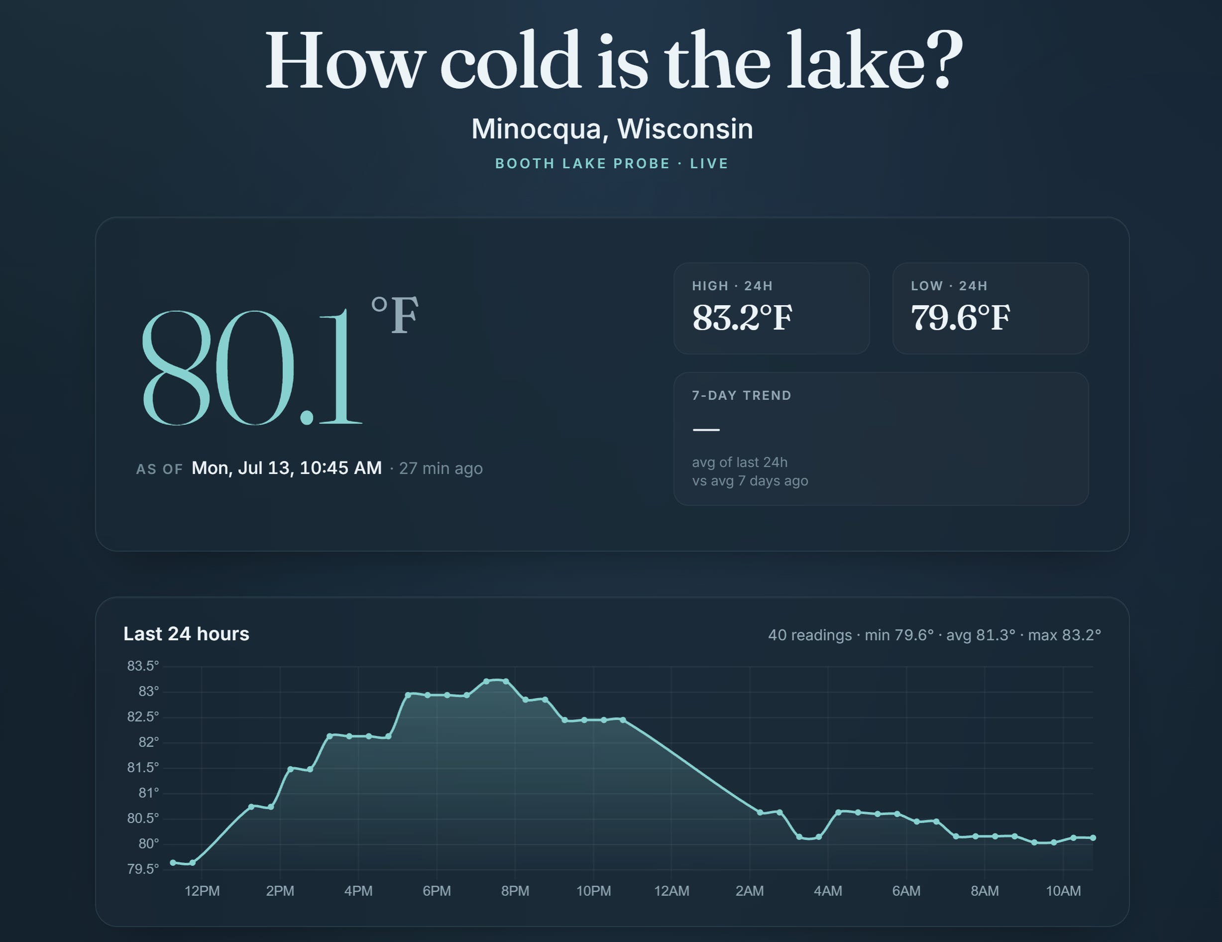
The downsides of bad information could get worse if you’ve promised a three year old a swim based on warmer than usual water, resulting in a tantrum and a lot of wasted packing up of water toys. But you’d have historical trends on the app to give you clues if the temperature feels abnormally high and a potential data quality issue.
Thinking about the site along those three big buckets of potential harm:
Audience: The primary audience is folks local to the lake. They aren’t usually making major decisions based on the water temperature and can verify the temperature themselves if needed.
Scale: The reach of any ‘harm’ from inaccurate information is likely to be limited and won’t have long ranging effects.
Source: The data is coming from a physical sense in the lake that could be verified with a secondary thermometer. The audience themselves can verify the data if needed by putting a foot in the lake (no analytics black box here).
Those patterns could look very different if a company is making a multimillion dollar acquisition deal or a hospital is using data in decision support systems though.
These considerations around the risk of harm are relevant for any data visualization project. But AI tools accelerate how quickly we can spin up visually engaging products and can create more distance between us as designers and the underlying data tables.
Even though we keep hearing in the news about the ways AI is reshaping work and making things more efficient, speed to deployment isn’t the only measure that matters. I hope that with some of the time savings in how we build things, we work with clients to spend more time building the right things.