

ONE vital thing when presenting data
Highlights from Chart Chat 68: How We Present Data (and Boxplots!)


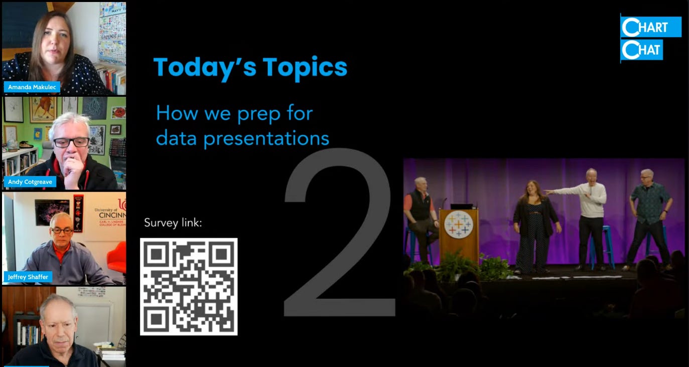
This is Andy saying “hi” and bringing you a Chart Chat 68 recap. Here’s what I have for you:
My most important tip for presenting data
A nod to magicians who also know the same secret
Where can you find me and my Chart Chat cohosts soon
(including Chart Chat #69: Our Favourite Olympics Charts)
In our last Chart Chat, I shared my one overriding principle whenever I share a chart:
Control Where Your Audience’s Eyes Are Looking.
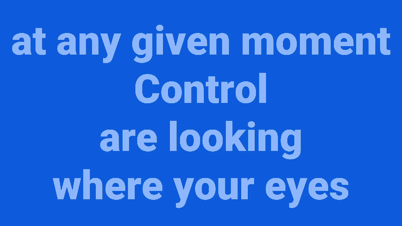
Charts, even simple bar charts, are cognitive barrages for your audience. Your audience has no idea where to look. Your job is to guide their eye through the data display
The good news is: it’s easy. Here are three ways I do this, each of which I demoed in the show. These tips apply whether you’re presenting virtually or live.
Use Shapes in PowerPoint
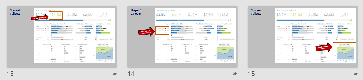
One method is to put arrows, shapes or other indicators over your charts. Those big red arrows in the image above? Your audience cannot help but look at them.
There’s an added bonus to this method: each slide acts as a script prompt to you while you present. When you click, the arrow shows up and reminds you exactly what your next point was going to be.
Use a good clicker/mouse.
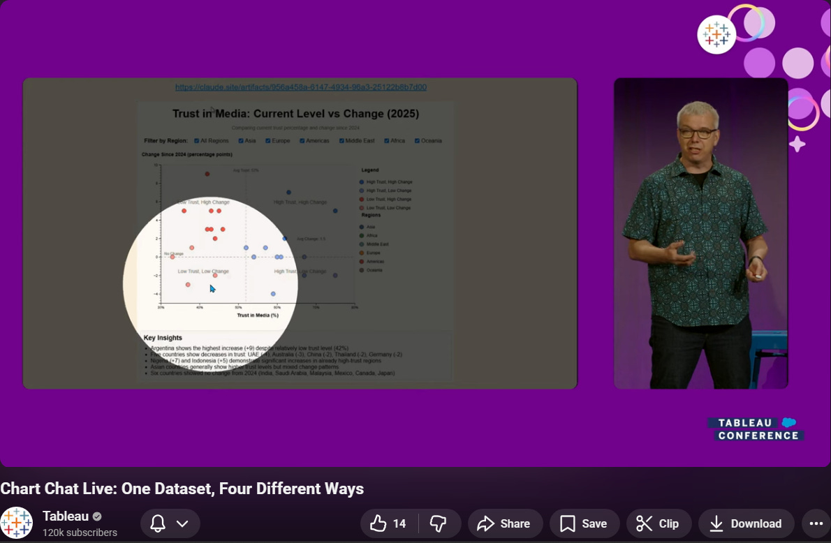
Look: if you deliver presentations, you need a great clicker.
The Logitech Spotlight transformed how I present. The above image is taken from Chart Chat Live at the Tableau Conference in 2025. I’m using the spotlight feature to lead people around the chart. Check out the full clip here.
The Logitech MX Master mouse also has the spotlight functionality built in, so you can bring this power to your virtual presentations, too.
Morphs and cropped images
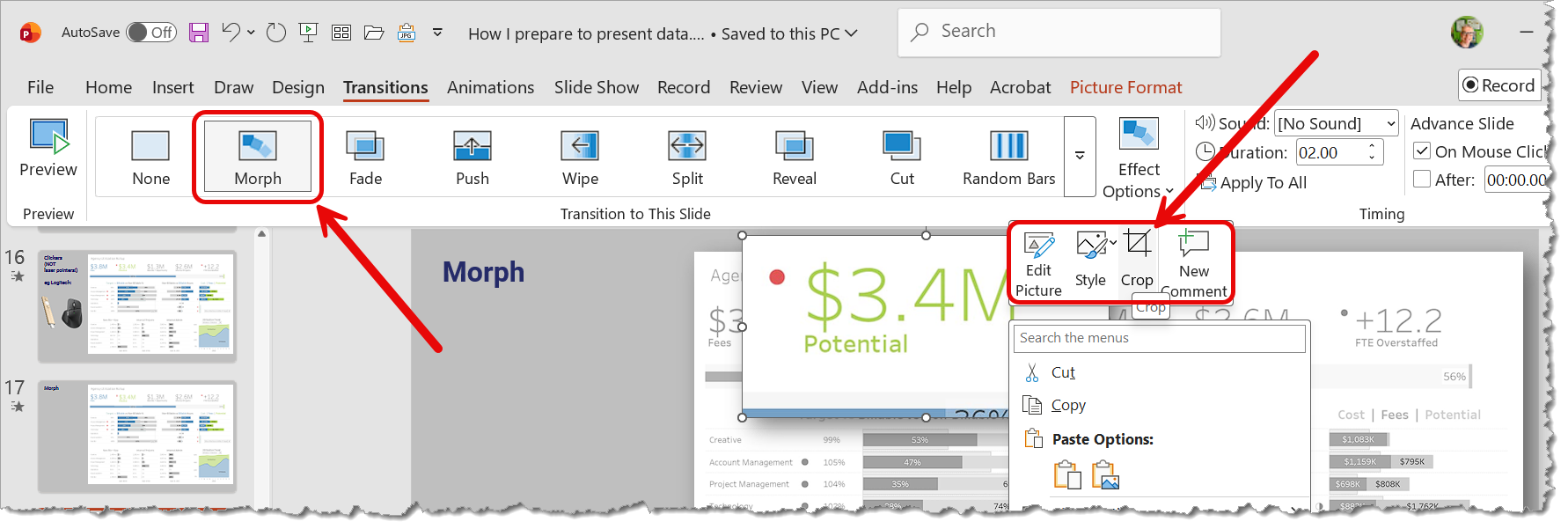
The final trick is to use two excellent features in PowerPoint: Cropped Images and Morph Transitions. It’s easier to see than it is to explain, so check out the clip.
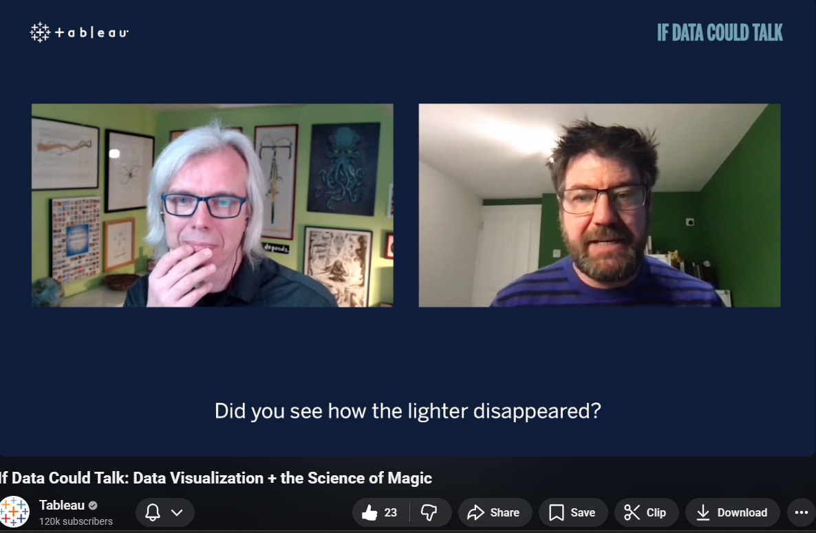
Magic helped me learn this
A quick side note: I spent a lot of the last 15 years doing close-up magic, too. Learning the art of misdirection helped me realise the importance of controlling peoples’ eye in presentations. Below is an episode of Talk Data To Me with magician and psychologist Gustav Kuhn, where we talked about the topic. (check out my Covid hair!)
In other news

In our next Chart Chat episode, we’re going to review our favourite charts from the Olympics. Join us on March 12, 3pm GMT.
What do you think about Chart Chat? Please fill out our survey.
Steve is on the DataFam TUG (tonight: Tuesday) for an AMA session as the TUG celebrates their one year anniversary this week
Amanda will be talking about shifting from desktop to digital display and how our design decisions change when dashboards are on big screens with the team at SkyKit
Andy is doing his How To Speak Data course at Data Decoded in London in April. He’s also delivering the keynote at the main event, so do go say hi.
He’s speaking in Stockholm in May at the Data Innovation Summit on the topic of Humanity and AI.
He’s also started a new video series, “The AI Analyst?” Andy’s goal: try to decipher how AI is changing the role of the data analyst. Follow him on LinkedIn to keep updated.
Do you wish you had a one-page design cheat sheet for making great dashboards? Of course you do! Guess what? We have one in our members’ area on DashboardsThatDeliver.com.