

Chart makeovers... with an AI sting
Did aesthetics seduce us into a false sense of security?

Hi,
Andy here with you this time. I hope you’re all well.
In this newsletter:
How Chart Chat 70 contained a hidden AI pitfall.
Details of Chart Chat 71 “Supercharge of Sabotage: The Two Faces of AI”. We’ll be discussing the issues raised in this newsletter and how we can tackle them: register here.
What are the four of us up to?
Our chart makeover episodes are among our favourites; it’s a pleasure to see how each of us takes the same starting point (a chart and its data) and spins it in four completely different directions.
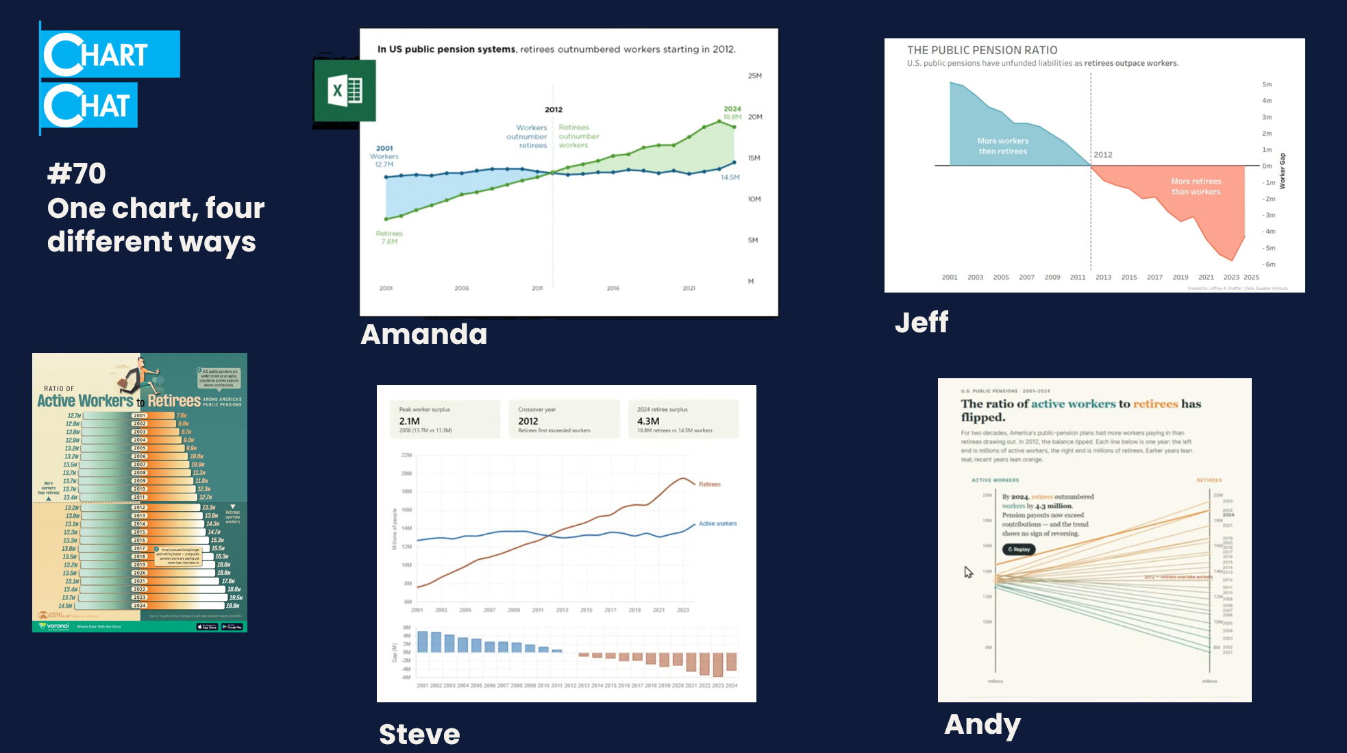
In this episode, we remade a chart by Visual Capitalist comparing the working and retired population numbers in the US.
The shaded line charts
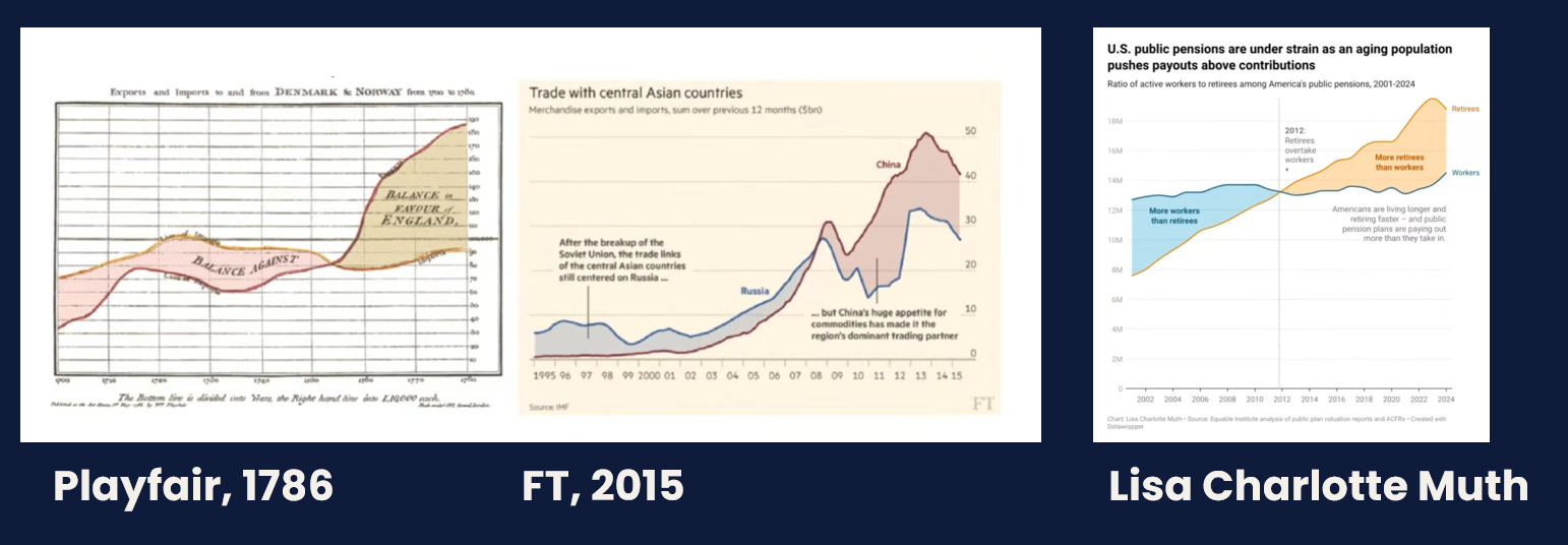
Jeff, Amanda, and Steve all created variations of shaded-area line charts. Lisa Charlotte Muth had also done the same in a LinkedIn post ahead of the episode. Jeff pointed out that the shaded line chart can be traced back to William Playfair’s pioneering work in 1786. We all felt this approach was the best way to display this data.
Jeff also shared a Claude-created dashboard, whereas Amanda stayed human and did it all in Excel (possibly quicker than those of us who felt productive doing endless prompting to “get things right” 😜).
A slope chart exercise
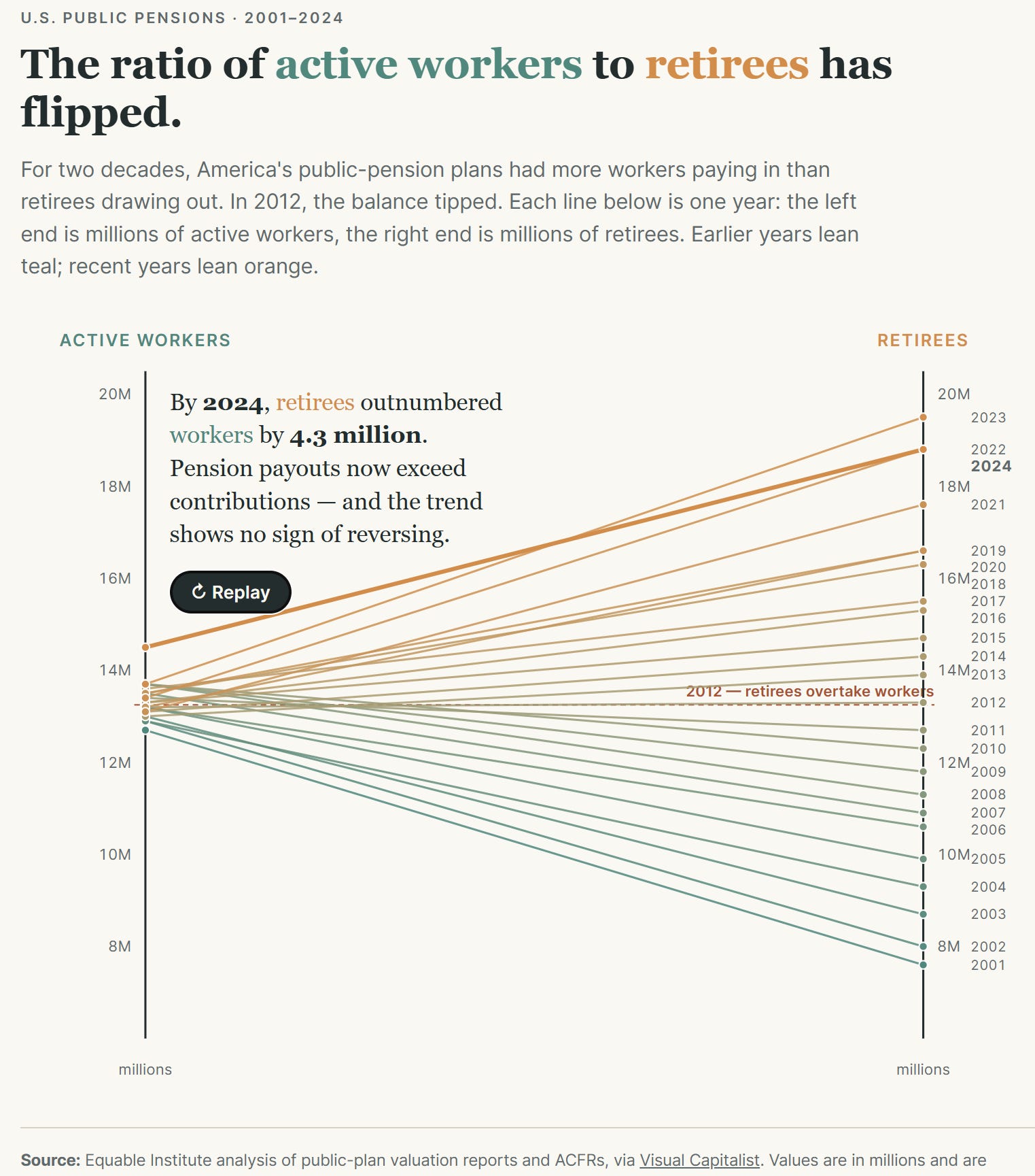
I took a different approach: an animated slope chart. Each line represents a year; I wanted a chart that allowed viewers to see the stark change in the slope over time [caveat: if we assume the data is correct. We did discuss that in the episode, if you wish to go watch it.
I vibe-coded this with Claude (you can go play with the app here), and it rendered exactly what I’d envisioned. I was pleased. Until Chart Chat itself. My colleagues and commenters pointed out that they didn’t understand the chart: they weren’t used to seeing a slope chart where each line represents one year.
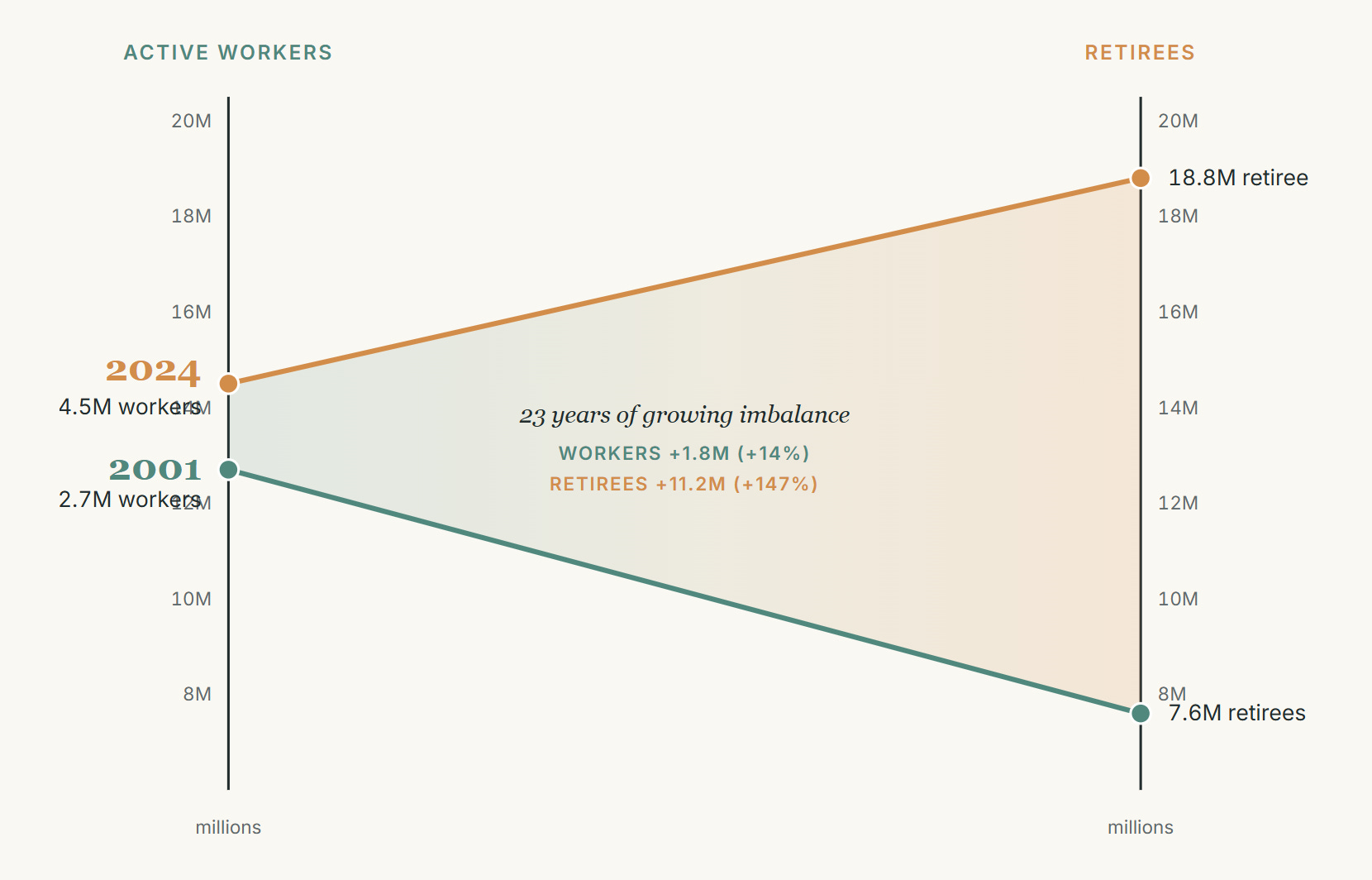
The lesson here is that I got carried away with my own assumptions of how people would interpret a chart. Just because I knew what the chart showed, it doesn’t mean others would. In our “After Party”, I created a few variations based on suggestions. This one seemed to be more intuitive:
Steve’s seductive dashboard
We need to talk about KevinSteve. We all enjoyed Steve’s story of vibe-coding with Claude to get this result:
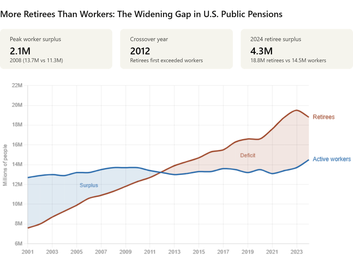
It’s lovely. Except… the numbers are wrong. It had hard-coded incorrect values in the BANs, and none of us noticed. Were we seduced by the calming aesthetics, leading us to trust the numbers?
I wrote in detail about the error here:

Is this a bad advert for AI? Let’s say the feelings among the Chart Chat camp are divided. We’ll bring this to life in our next Chart Chat episode. As I speak to people across the data storytelling space, I continue to see divided opinions. Some people are bullish, others are terrified. As I wrote in my post above, this has hugely reduced my trust in genAI for analytics.
What do I recommend?
If you’re using the genAI models to analyse your data, make sure your prompts are extremely detailed.
Tell the AI to explain how it calculated all the numbers on display.
Ask the AI if any numbers were hard-coded and if so, why.
Create a risk matrix for yourself, or your team: what’s the impact of wrong numbers in any project you are doing?
I confess: I find all of those recommendations unsatisfying. The promise of genAI is that you don’t have to do any of these. The reality is that the UX of genAI requires you to be an excellent prompter and to treat these “super-tools” as nothing more than naive, enthusiastic interns. (Note to self: Jeff will have words to say about this perspective!).
What do you think? Are you pushing ahead with genAI for your data applications? How’s it going?
In our next Chart Chat, we’re going to be discussing this as our main theme, https://www.eventbrite.com/e/chart-chat-71-supercharge-v-sabotagethe-two-faces-of-ai-data-analysis-tickets-1989837704138?aff=dtdnews.
What’s happening elsewhere

Chart Chat 71: Sabotage of Supercharge: The Two Faces of AI.
I have some fun projects underway.
I’ve been exploring Tonic Fabricate, a great platform for making synthetic data. There is a demo video here, and next week, I’ll be joined by Mark Brocato (Tonic’s Head of Engineering) on The AI Analyst)
The Veezoo Analytics Cup is your chance to try out Veezoo with a World Cup dataset and have a chance to win a MacBook or iPad. Entries open until May 25th.
I did my “How to stay human in the age of AI” keynote at the Data Innovation Summit in Stockholm last week. My last newsletter was all about the topic, and you can watch the keynote here.
Amanda is delivering her workshop “Data Visualisation for Public Health” online, beginning on June 12th. This is an excellent chance to learn from one of the best!
Amazon are doing great deals on our books, right now. Steve's book, The Big Picture (winner of Data Literacy's best data viz book), is for sale on Amazon for just $19.85 (US Amazon link). That's the lowest price since the book first came out.
That’s all for now.
Don’t forget to join us for Chart Chat 71 on June 18.
Best wishes
Andy